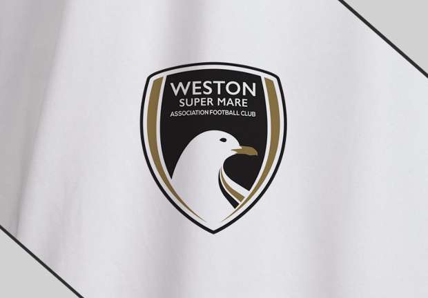
WESTON-SUPER-MARE have unveiled a new club crest which has been designed to symbolise the National League South outfit’s “dynamic future”.
The Seagulls won five of their last eight games to secure their Step 2 status for next season with relegation looking a distinct possibility back in March.
The club studied badges and logos from around world football with the ultimate goal to “maintain an iconic and recognisable crest” alongside design company Ketchup.
Gold was added to the club’s iconic black and white colours on the new crest to celebrate the 30 years that chairman Paul Bliss has been at the helm. The Seagulls have also stayed local by using the ‘Gull Sans’ typeface which was created in nearby Bristol.
Weston commercial director Neil Keeling said: “The club has grown and evolved over the last 30 years, so we felt the time was right for a change.
“Over the past two years we have been working closely with Ketchup to improve our matchday programme and our online presence which includes our new-look website and to increase awareness and communication through our social media channels bringing the club up to date from a design and digital perspective.
“It seemed only right that Ketchup were integral in breathing new life into our club crest ready for a new season and a new generation of Seagulls. They have refreshed our club crest to reflect who we are today and to symbolise our dynamic future.
“This wasn’t a decision taken lightly. We are proud of our history and who we are; however we are also aware that we need to bring the club fully into the 21st century.”
Ketchup’s Steve Jackson added: “Designing this new crest was one of the toughest jobs we have undertaken to date.
“Football fans are passionate about their history and understandably aren’t too keen on ‘re-brands’ but we believe that what we have achieved here will confidently and proudly carry the club towards its new future.”


